Sunday, 18 October 2020

NGO

SUMMARY OF MY CHOSEN NGO

THE MAURITIUS SOCIETY FOR ANIMAL WELFARE (MSAW)

The Mauritius Society for Animal Welfare is well-known in the island and this NGO has two main objectives. Firstly, it gives good treatment for animals and promote well-beings. Furthermore, the MSAW makes campaign so that to deliver communications all around the island such as schools and other welfare centers.

This NGO also makes awareness to the public in order to teach them how to be responsible towards their animals.

 Moreover, I have chosen this NGO as I am against animals abuse and also to give them a family in which they will be happy.

In my opinion, I think that any living things need to have a shelter and to be safe. It is normal to be afraid sometimes when you don't have a place to live and nowadays danger can appear at any time, and it is the same feeling for an animal.

Problem statement

The MSAW logo has never been changed and it looks more likely a hospital logo than a welfare for animals.


I agree that this NGO is here to give treatment to animals but has not mention to give a home to them visually on the logo.

Thus, I want to give it a new look so that to make people aware about treatment and adoption of these innocent life.

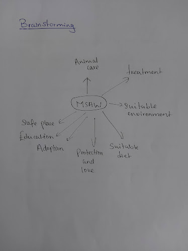
Brainstorming


Research

What people actually want to see about this NGO?

The public want something simple so that to remember about it and also know the signification of the NGO.

How to represent the logo?

  • colour
  • graphic
  • explicit
  • simple

How to communicate to the public about the work of this NGO and how to help them in the future?

  1. Make awareness of how the NGO is helping in the society
  2. Raise money to help animal in needs
  3. Educates friends and family about how MSAW help animal and how can they contribute to it
  4. Adopt animal from shelters
  5. Spread the word

Sketching/ideas


FINAL


Moodboard


Monday, 5 October 2020

Task: Identify 2 graphic designers who have inspired you

1. I have been inspired by Jessica Walsh (born: 30 October 1986) an American graphic designer. She is also an art director, illustrator and she has a company of creative agency &Walsh. She has a retro and vibrant style designing which I admire. 


 One of her Youtube page is: 
https://youtu.be/YG_Ipmux2cM

Another creation of her work:

"The Future of Everything is a Wall Street Journal magazine that covers future trends in a range of industries, from food and travel to sports and technology." 

2. The second graphic designer is Chuck Anderson live in Chicago. He is born in  1985. Furthermore, he is a photographer, artist, creative director and a graphic designer. I have been impressed as he opened his own studio at the age of 18 and his clients were famous that is, he was working for Nike, ESPN and Vans. He know exactly how to be a perfect graphic designer as his illustration designs are perfect and vibrant in the modern generation.

One of his youtube work :

https://youtu.be/Hsx11WFTHl0

His artwork:

Theme: Nopattern


Thursday, 1 October 2020

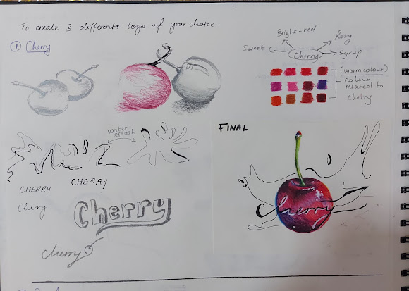
Logo 1 : Cherry (expressive lettering)


 In this logo design I wanted to make the cherry juicy and attract the one who is watching it. I have added lines all around to represent syrup while the cherry is falling. For the lettering I have wrote it in such a way where we can see that the Cherry is chilling/relaxing.


Logo: Speed (expressive lettering)


 For this logo design I wanted to show that the speed is very fast. To make it more interesting I have added a car so that, it brings the adrenaline feeling while driving in a way where there is no end.


Logo: hot chocolate (expressive lettering)


 To make this logo I have been inspired by chocolat and I wanted to show the melting of it. So I decided to create the hot chocolate and put the lettering in bold. Then I have put a heart in the chocolat because many of us love these sugary product sometimes.

Typography of my name


Foodiscovery Poster